#Visit Website
About
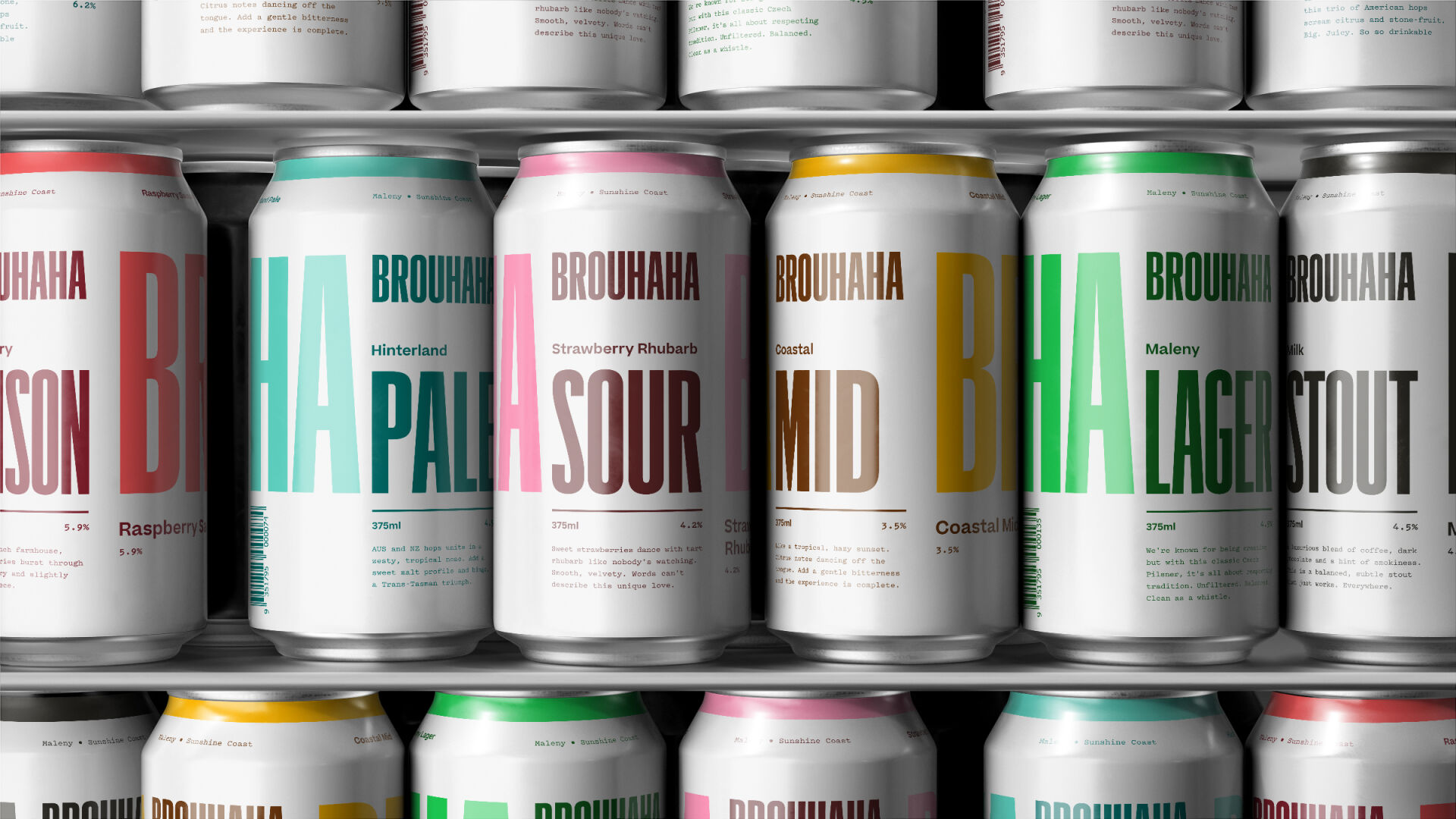
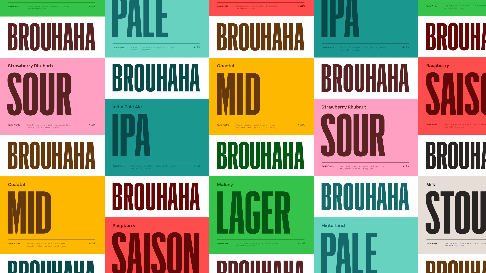
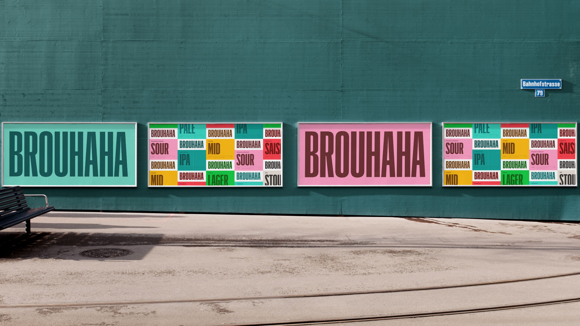
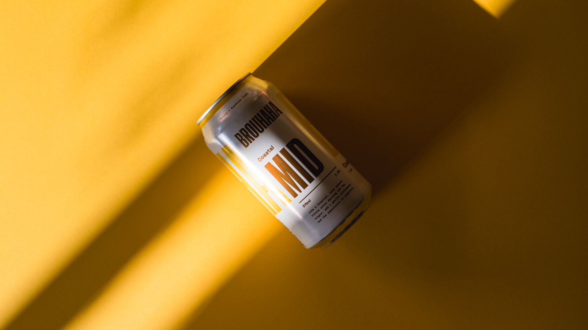
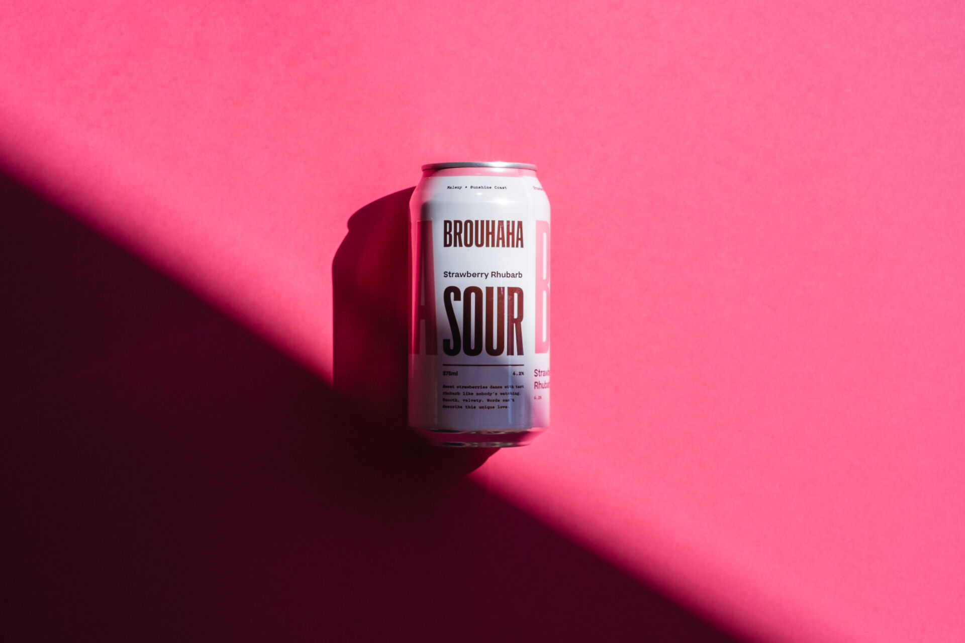
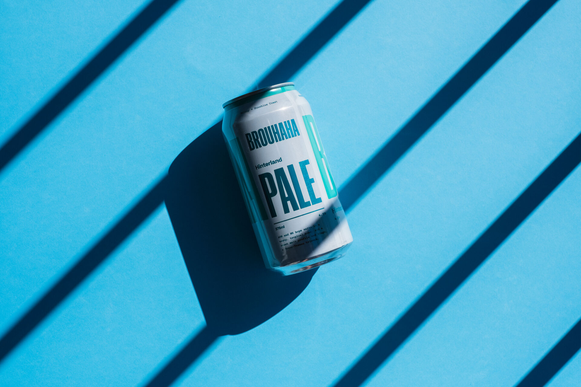
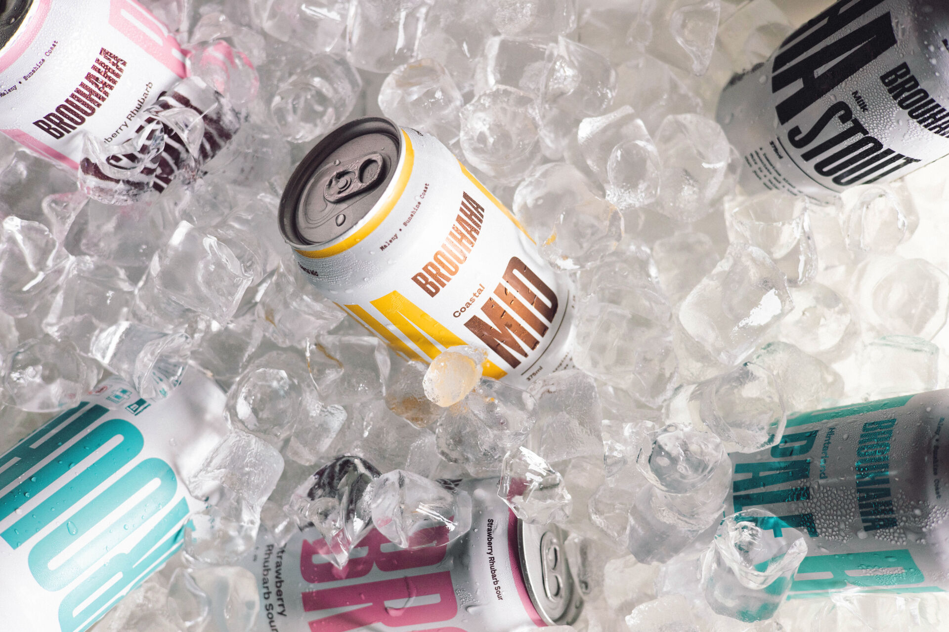
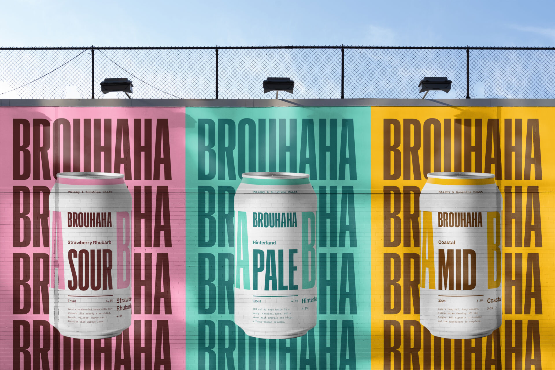
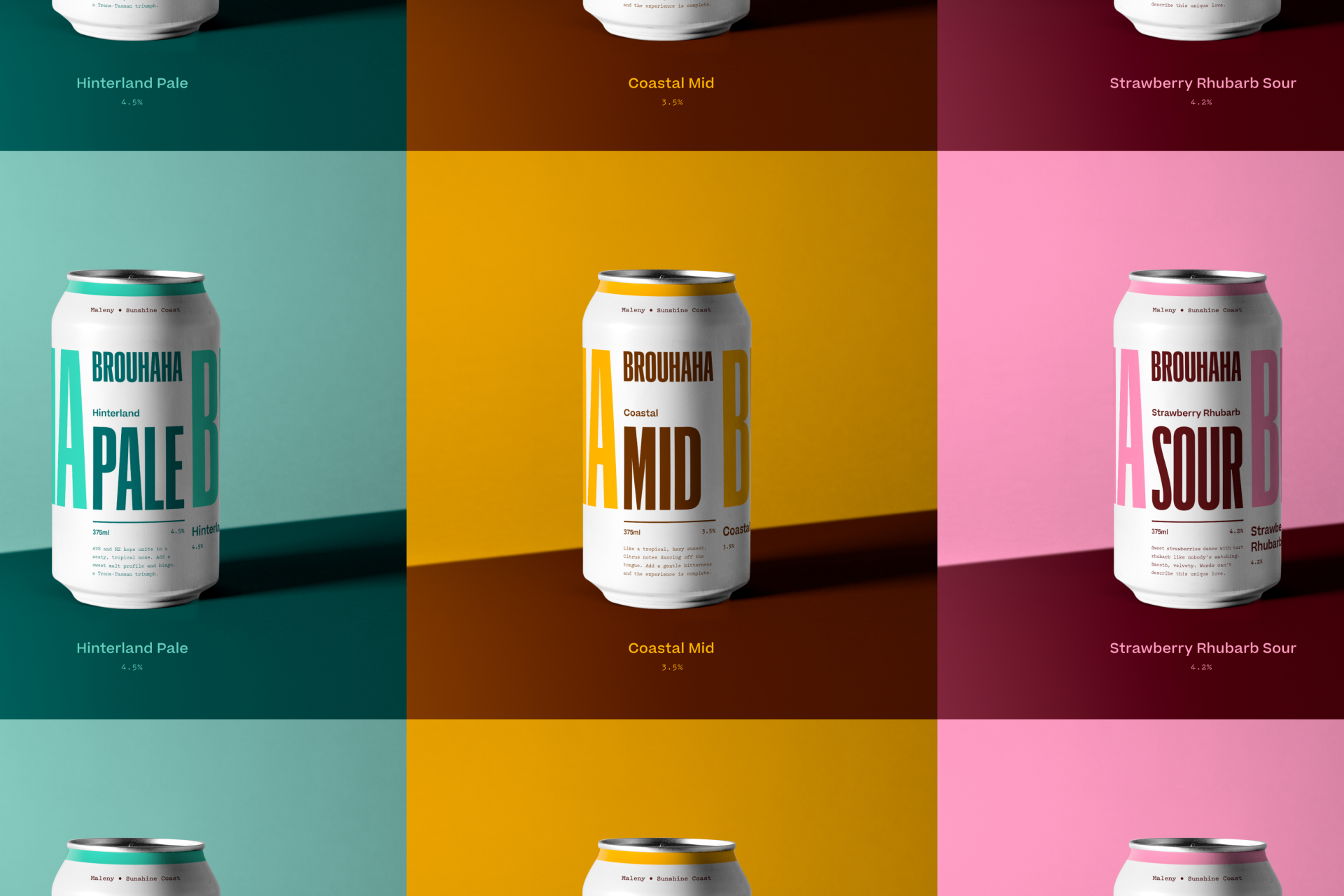
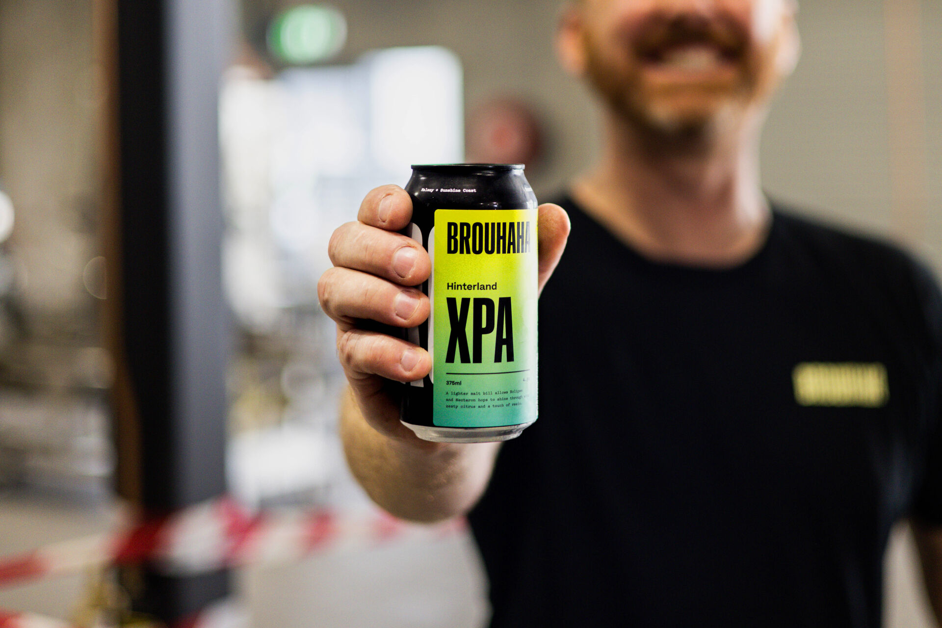
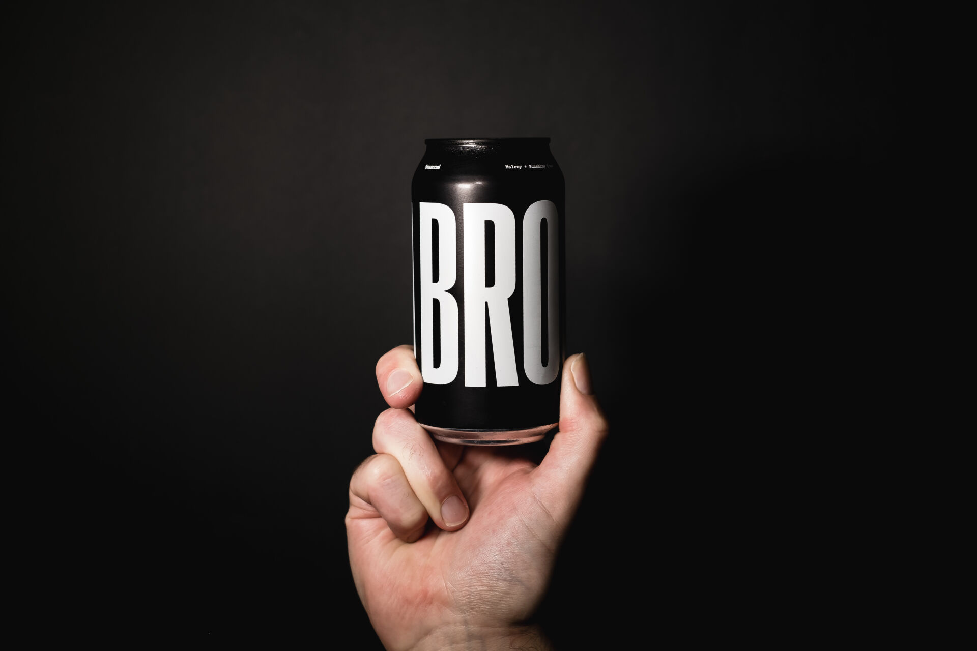
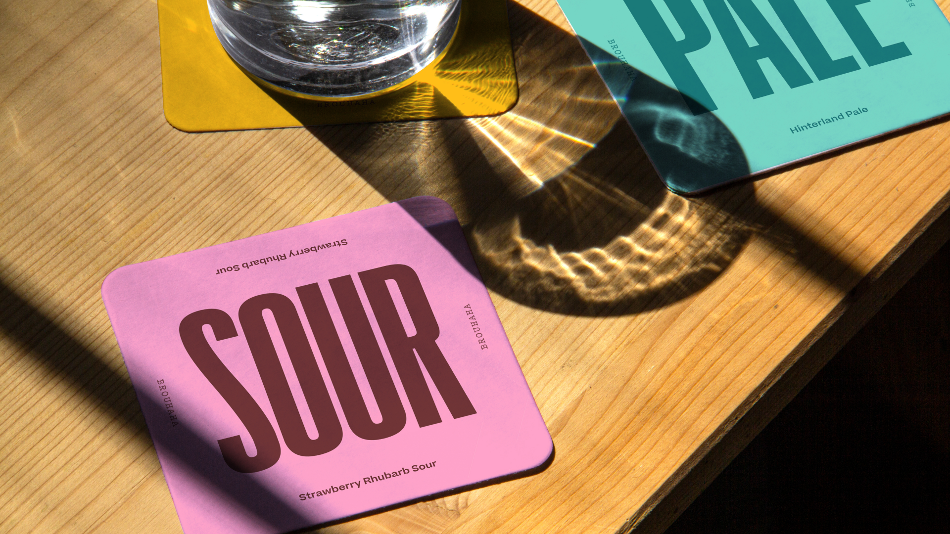
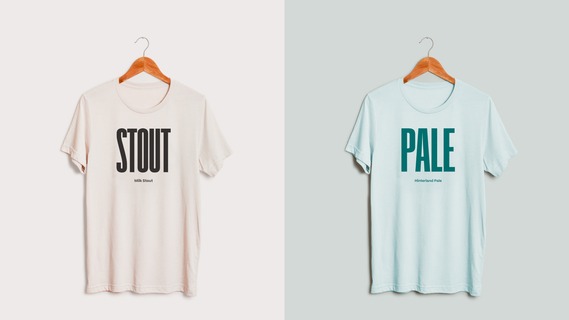
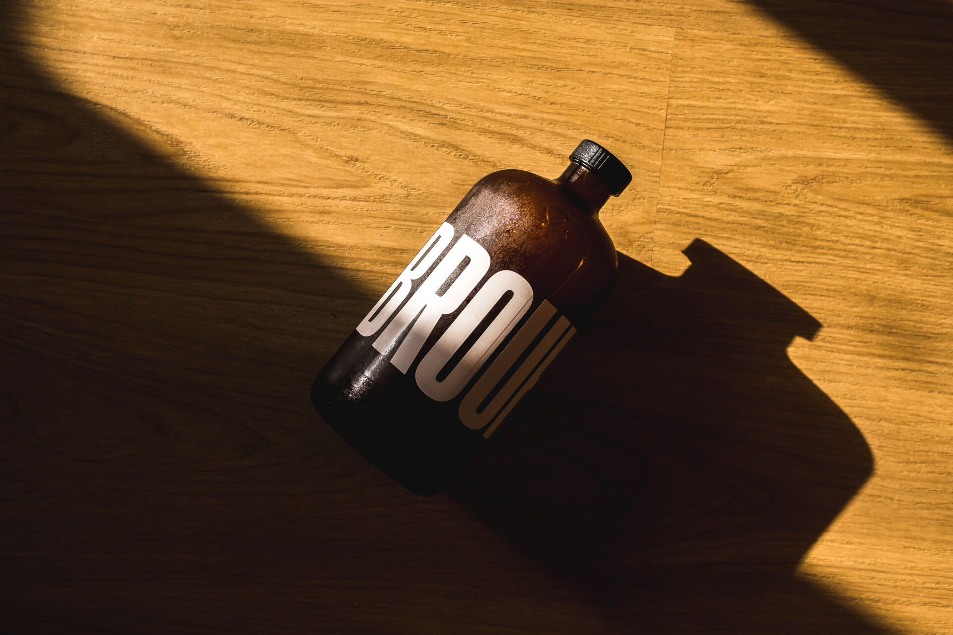
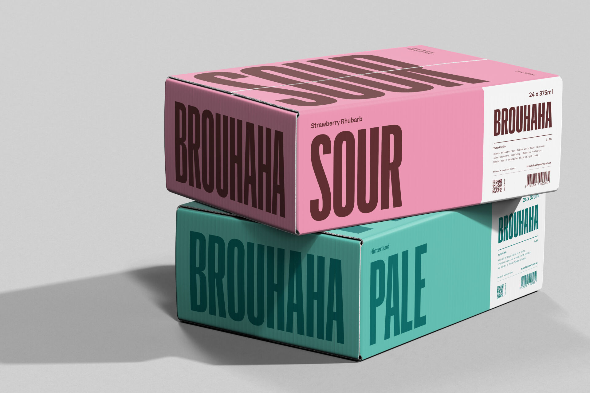
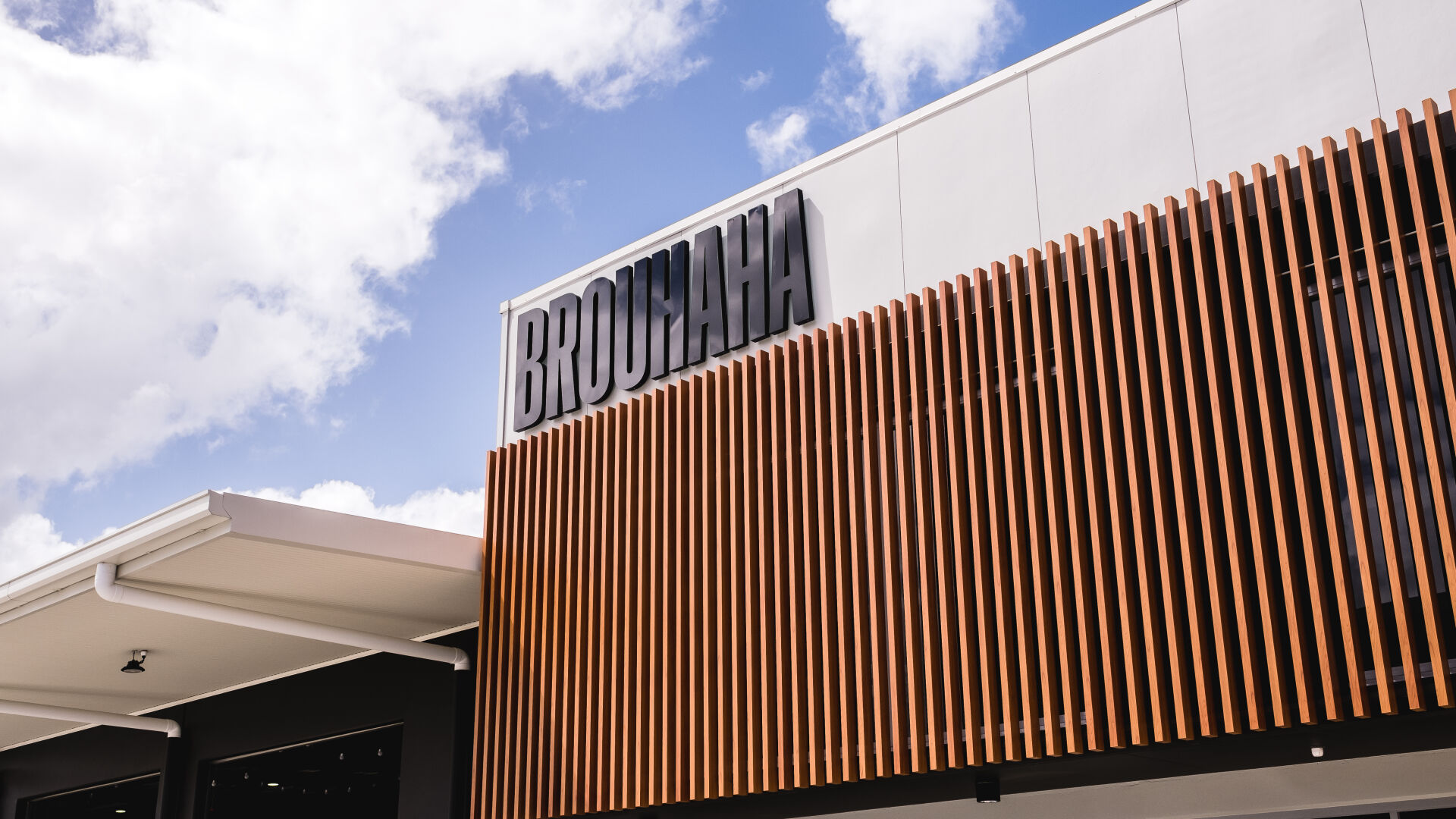
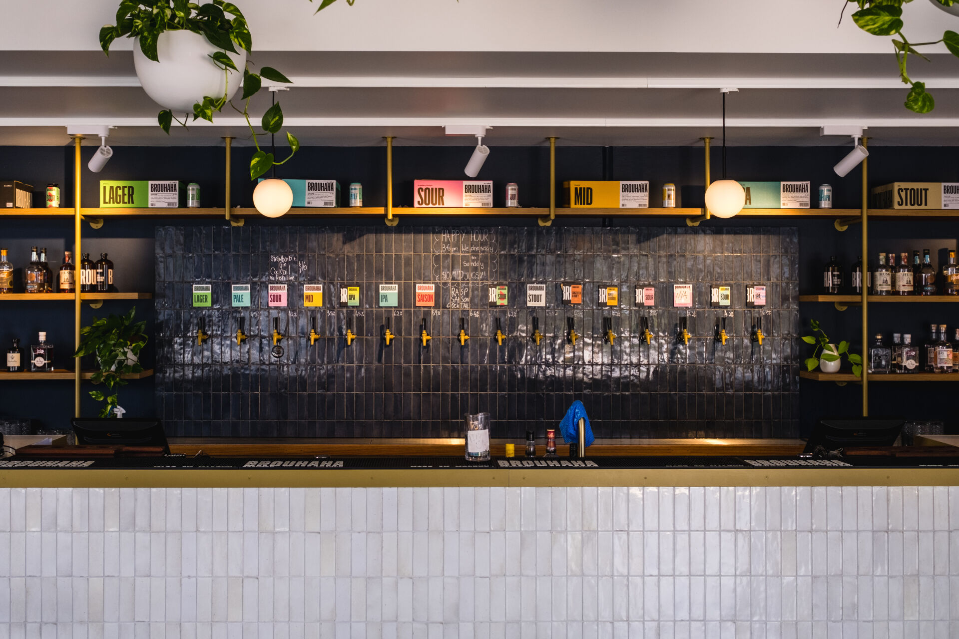
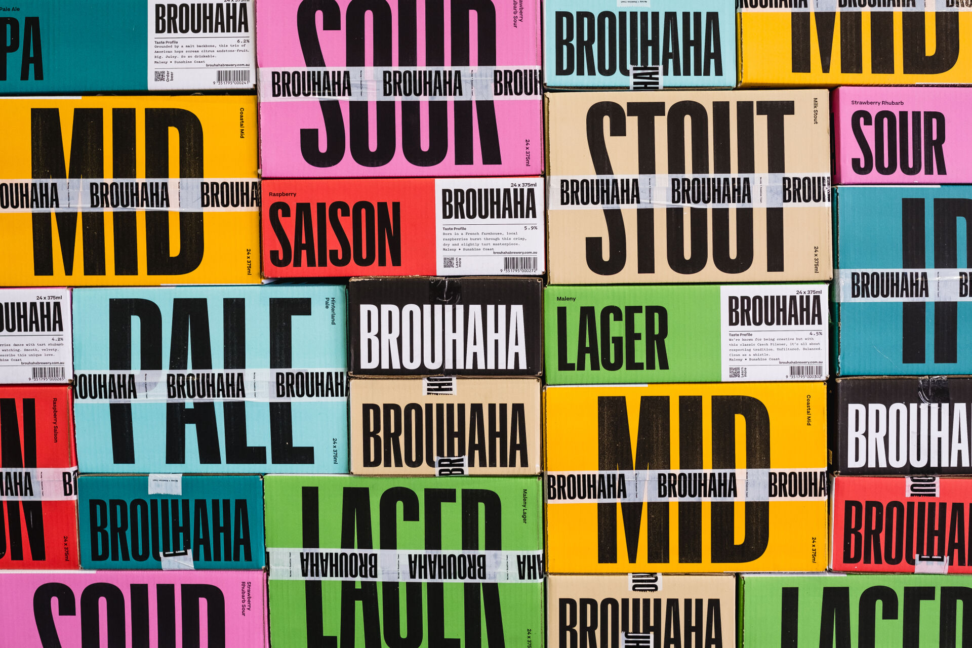
A bold design for a bold beer
The name BROUHAHA had such intriguing typographic rhythm that is became the central approach of the design. The rest was about keeping it as minimal as possible – white base, simple typography with only a single colour changing from beer to beer. With Brouhaha wrapping around the can, the style of beer became the hero of the front to create a can design that is recognisable and visually bold from all sides. The campaign focused on this unique multi-sided design rotating around to show off all its great angles and backed by bold BROUHAHA typography.