About
Brand Refresh
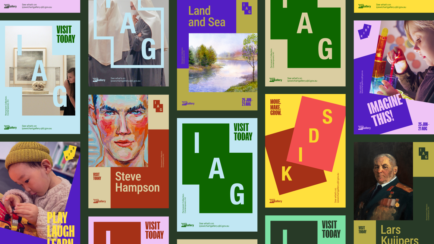
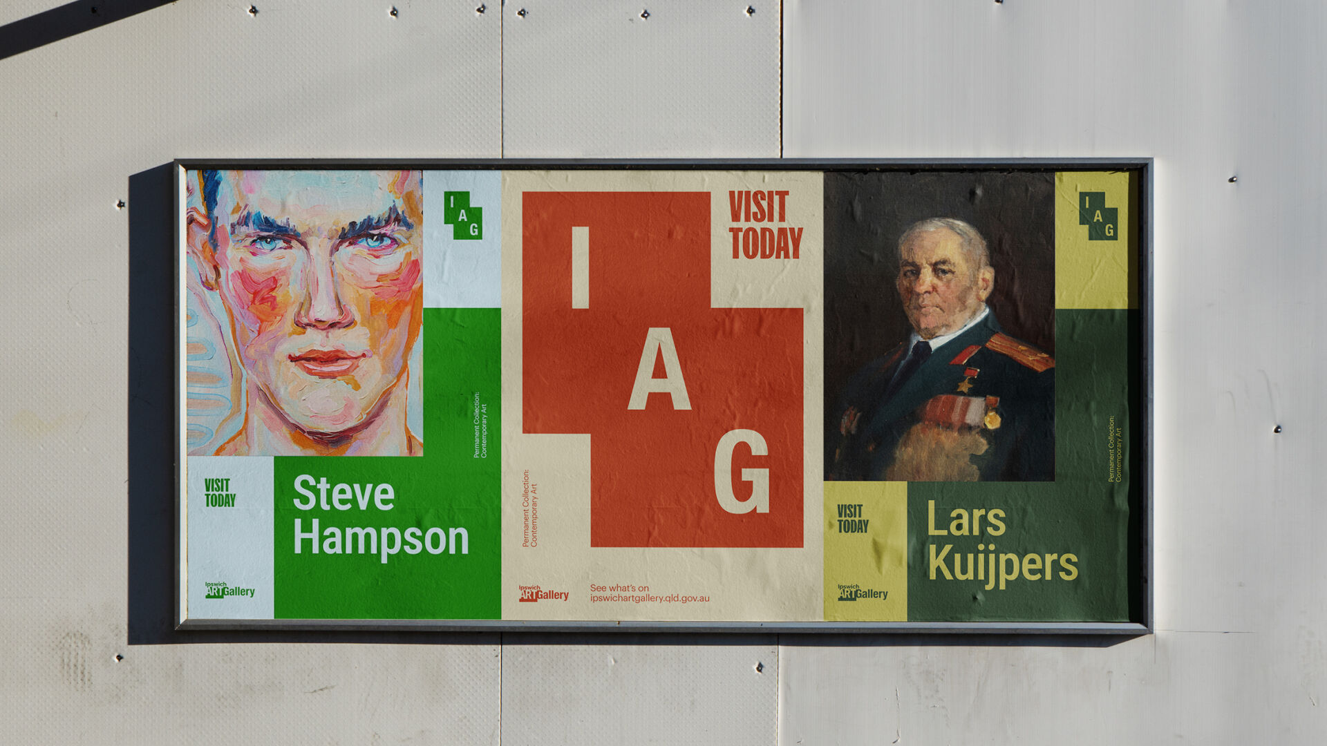
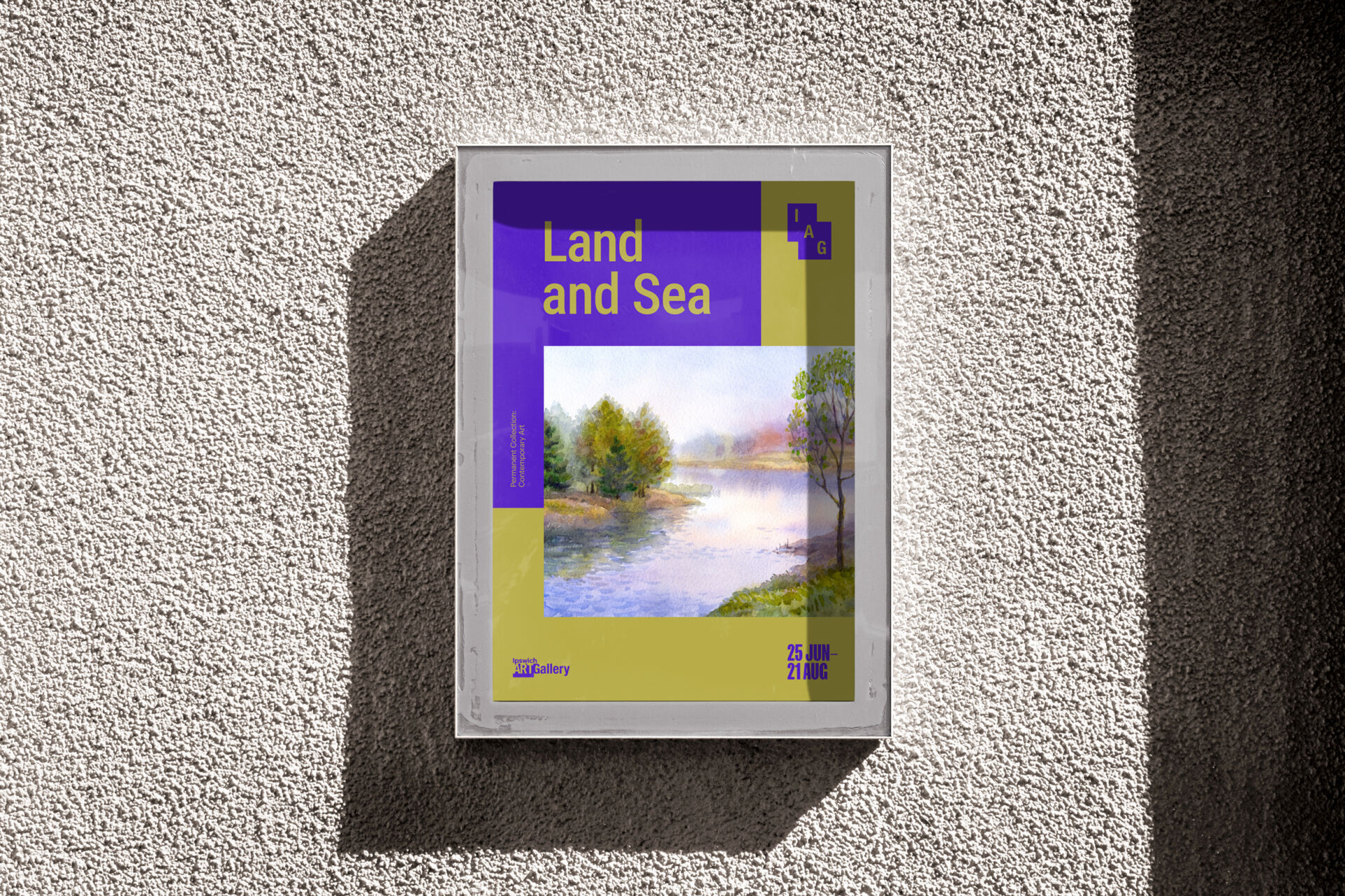
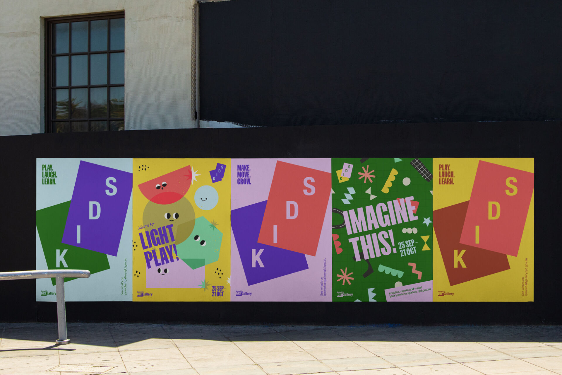
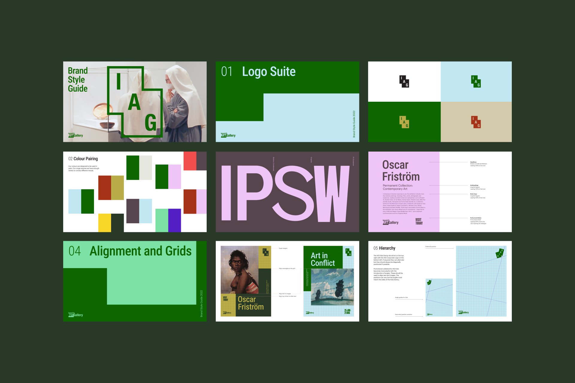
Building on the legacy Ipswich Art Gallery logo, we introduced an IAG stamp for a modern & contemporary new direction. Inspired by the angular graphic principles of the legacy logo, the stamp's stepped aesthetic acts as a launchpad for the wider brand – layering art, colour and typography together. The shapes then playfully dance to adapt to IAG's growing kids program, giving the sub-brand its own life, while still anchored to the master brand. The colour palette is inspired by the natural beauty of regional Queensland: classic and confident. A timeless set, used together to create a uniquely Ipswich visual language.


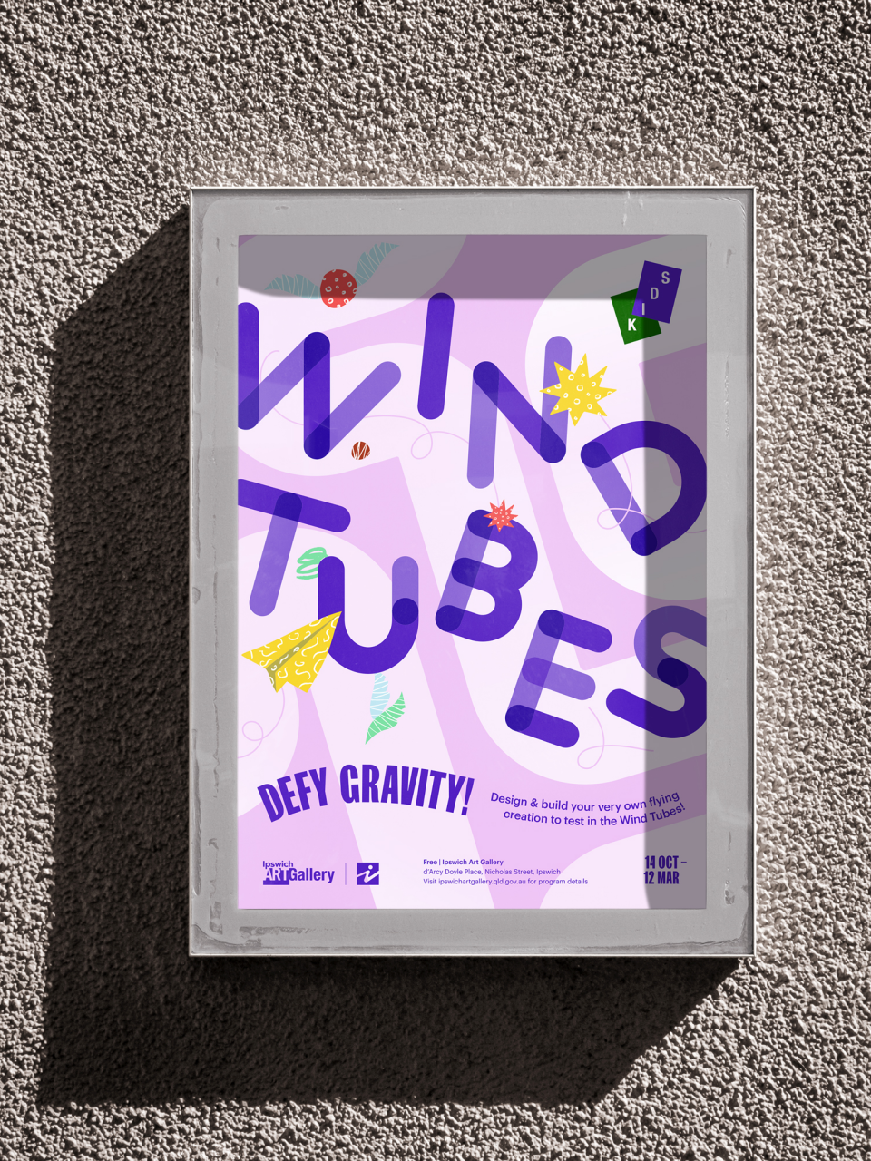
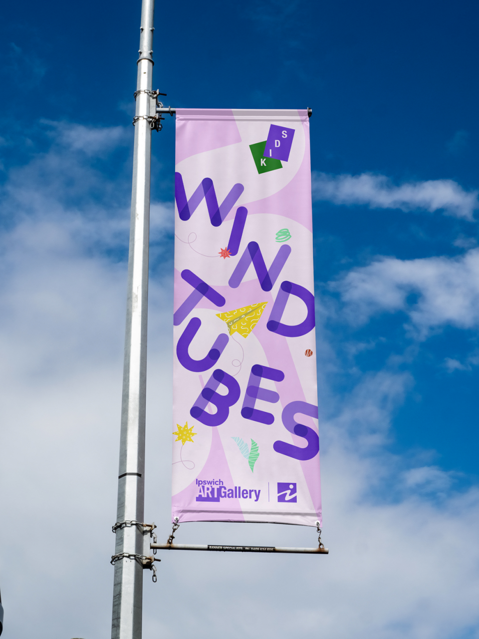
Bringing Wind Tubes to Life
Wind Tubes is a staple exhibition at Ipswich Art Gallery, encouraging kids to create an aerodynamic craft out of everyday materials. In refreshing the Wind Tubes exhibition, we took the core elements of the new Ipswich Art Gallery brand and injected a sense of levity. We created a dynamic logo that effectively never sits still, with multiple variations suggesting different moments in flight. This was accompanied by playful illustrations that we used across posters and banners, which were brought to life in an animated video we created to promote the exhibition.