About
Honouring the old, celebrating the new.
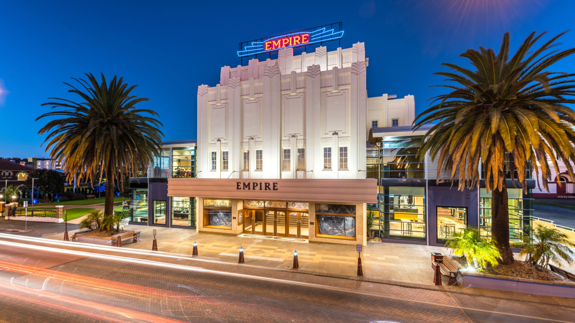
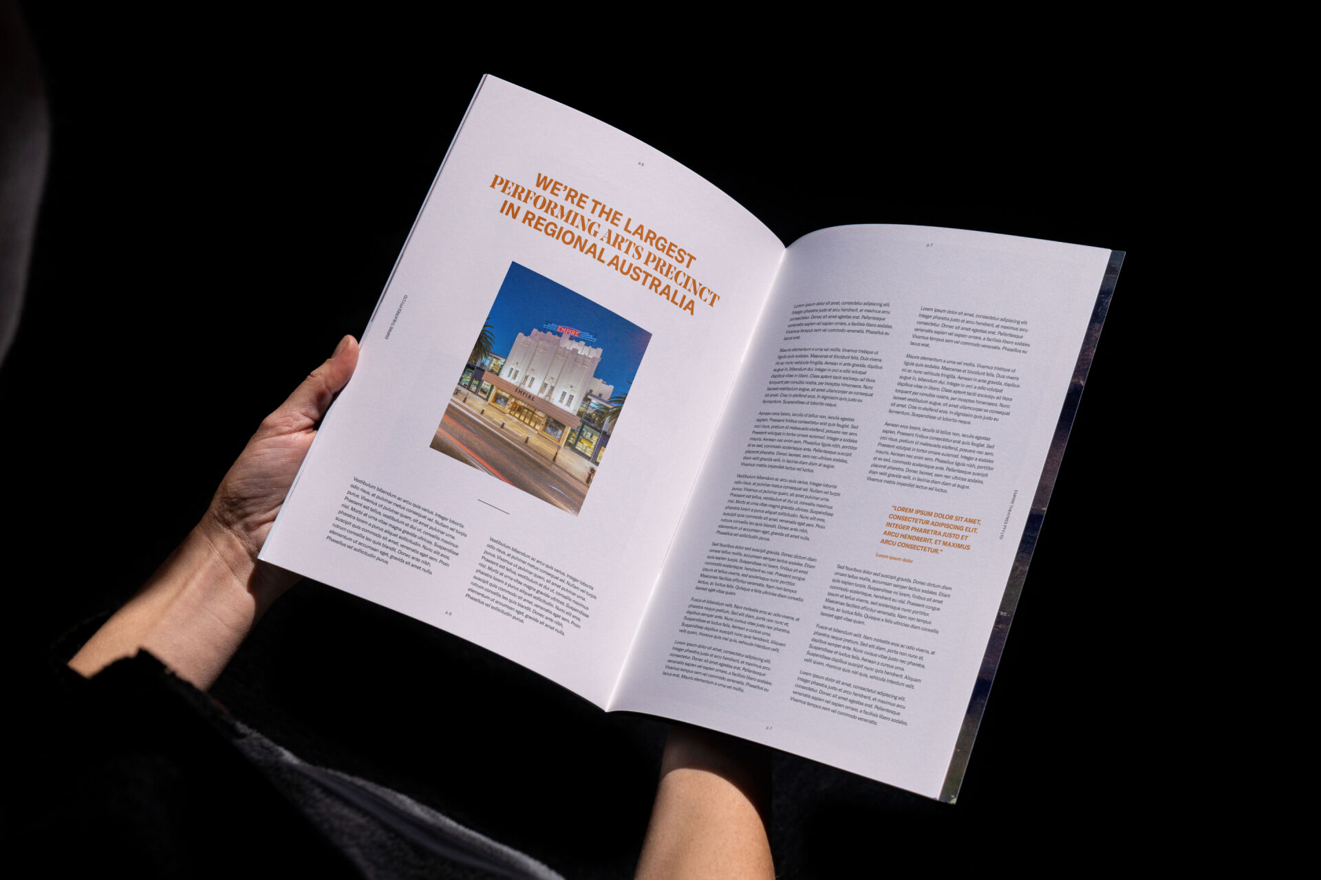
While The Empire Theatre is widely known for its iconic art deco, heritage-listed building, they are also the largest regional performing arts precinct in Australia, with world-class performances and contemporary programs. This sense of prestige on both fronts had created a bit of an intimidating reputation for local audiences, who saw it as a place for special occasions and fancy garb. In revitalising their brand, they wanted to counter this intimidation factor and expand their audience to include younger generations.
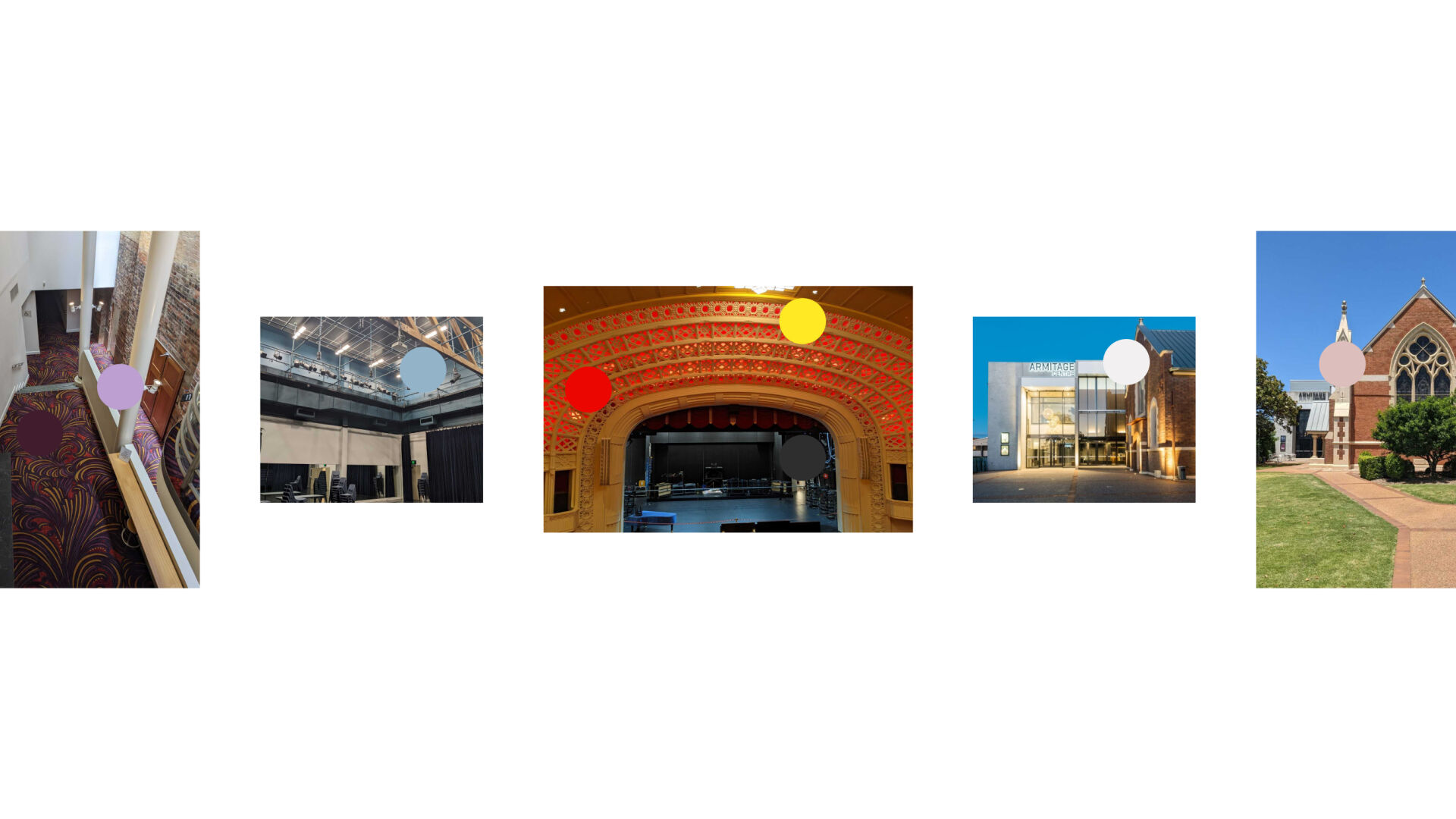
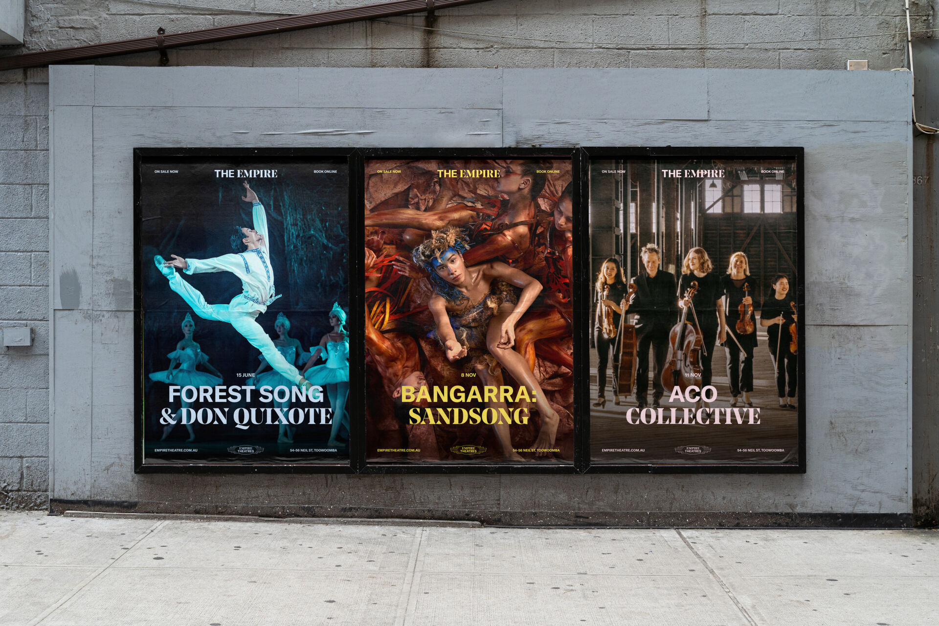
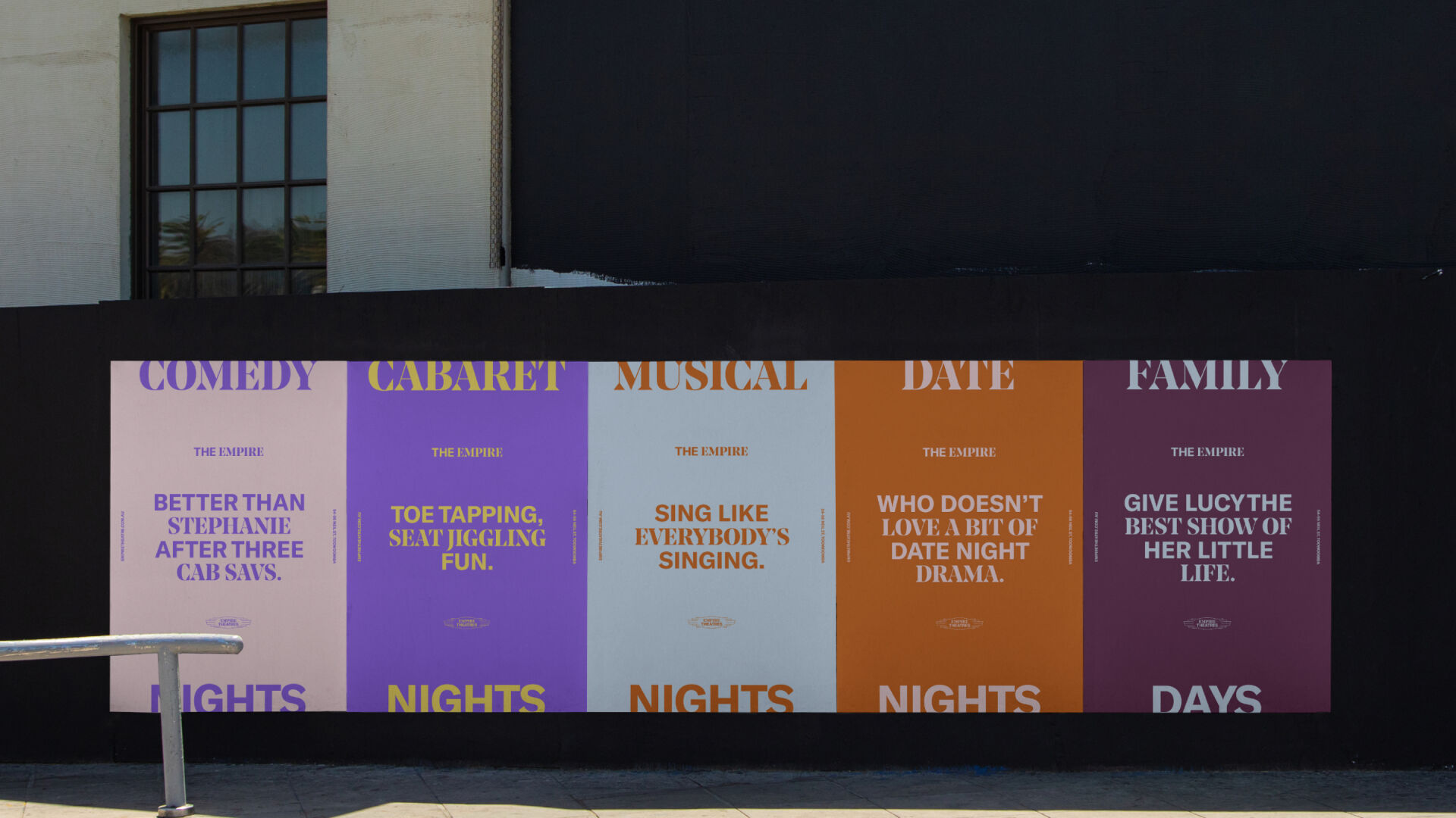
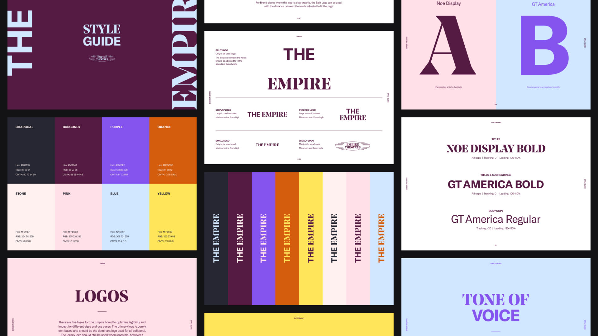
To create an authentic brand that resonated with loyal patrons as well as new, we approached the brand refresh with an eye on duality: honouring its heritage and history but contrasting that with a contemporary aesthetic to bring the brand into the 21st century. We did this by interchanging two contrasting typefaces to create a unique, ownable look; and an expanded colour palette based on the theatre precinct that is flexible enough to capture all the sides of the brand: exciting, adventurous, historical, artistic. We also refreshed their existing logo to ensure a sense of continuity, but created a new logotype using their colloquially-used name: 'The Empire'.
Services
- Brand
- Website
- Visual Identity


Tone of Voice
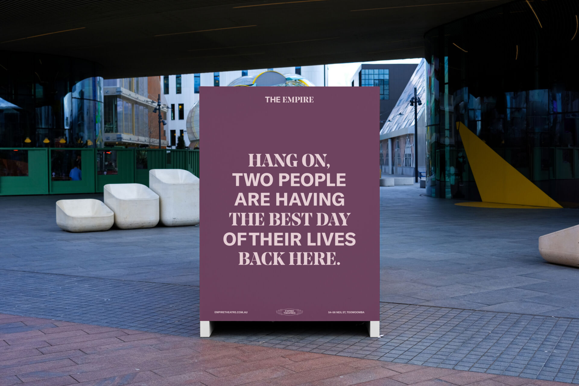
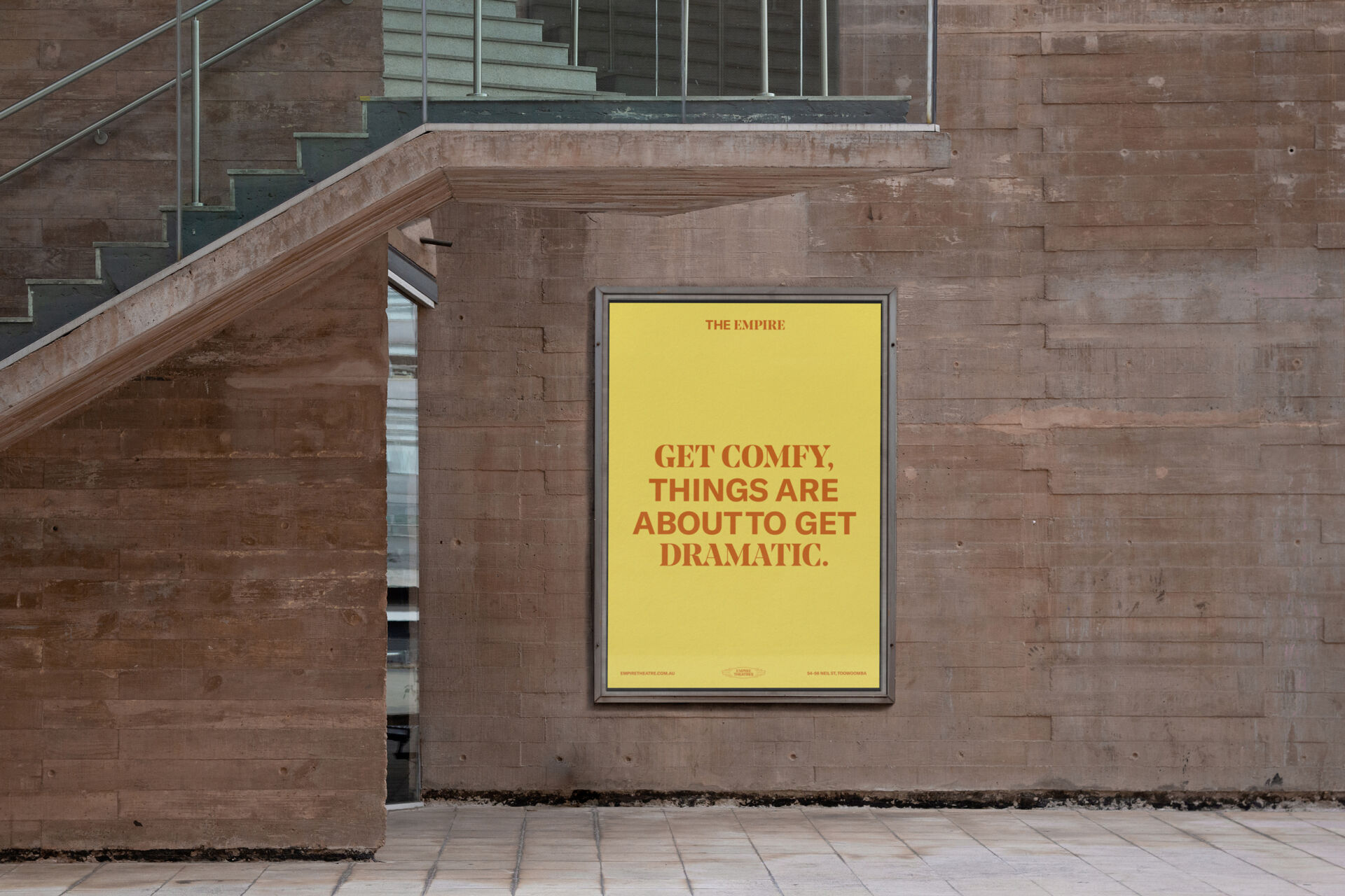
We developed a conversational and warm tone of voice to make the brand feel down to earth and relatable, countering the perception The Empire is intimidating. By speaking as if to a friend (even including people's names and slang), The Empire feels part of the community.


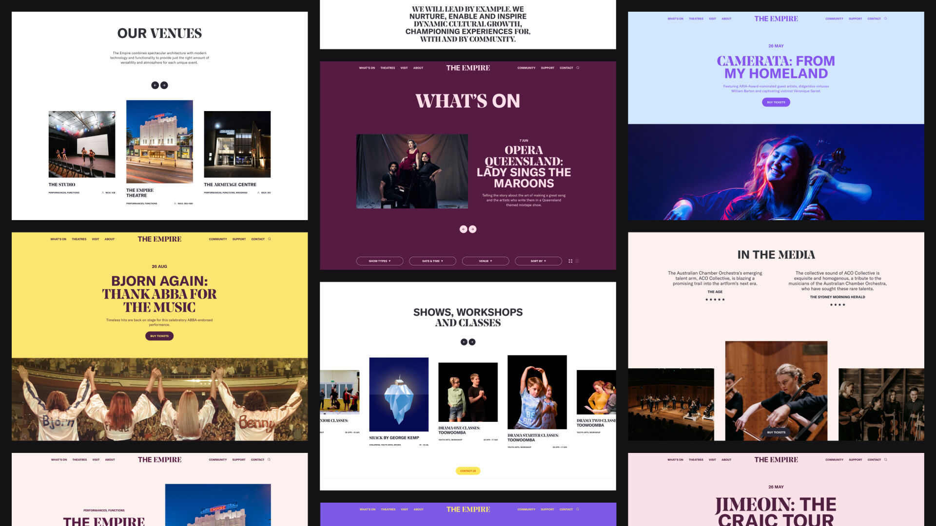
Website
The website needed to be usable first and foremost, catering to the diverse audience members' needs. This meant AA accessible, large type, clear UI indicators, and effective filtering. We also developed a scheduling tool for their featured shows so they could set and forget. Aesthetically, we utilised the varied colour palette throughout the site, with the unique colour combinations creating a distinct personality for each show, while still feeling quintessentially 'The Empire'.