About
Banking with personality and warmth
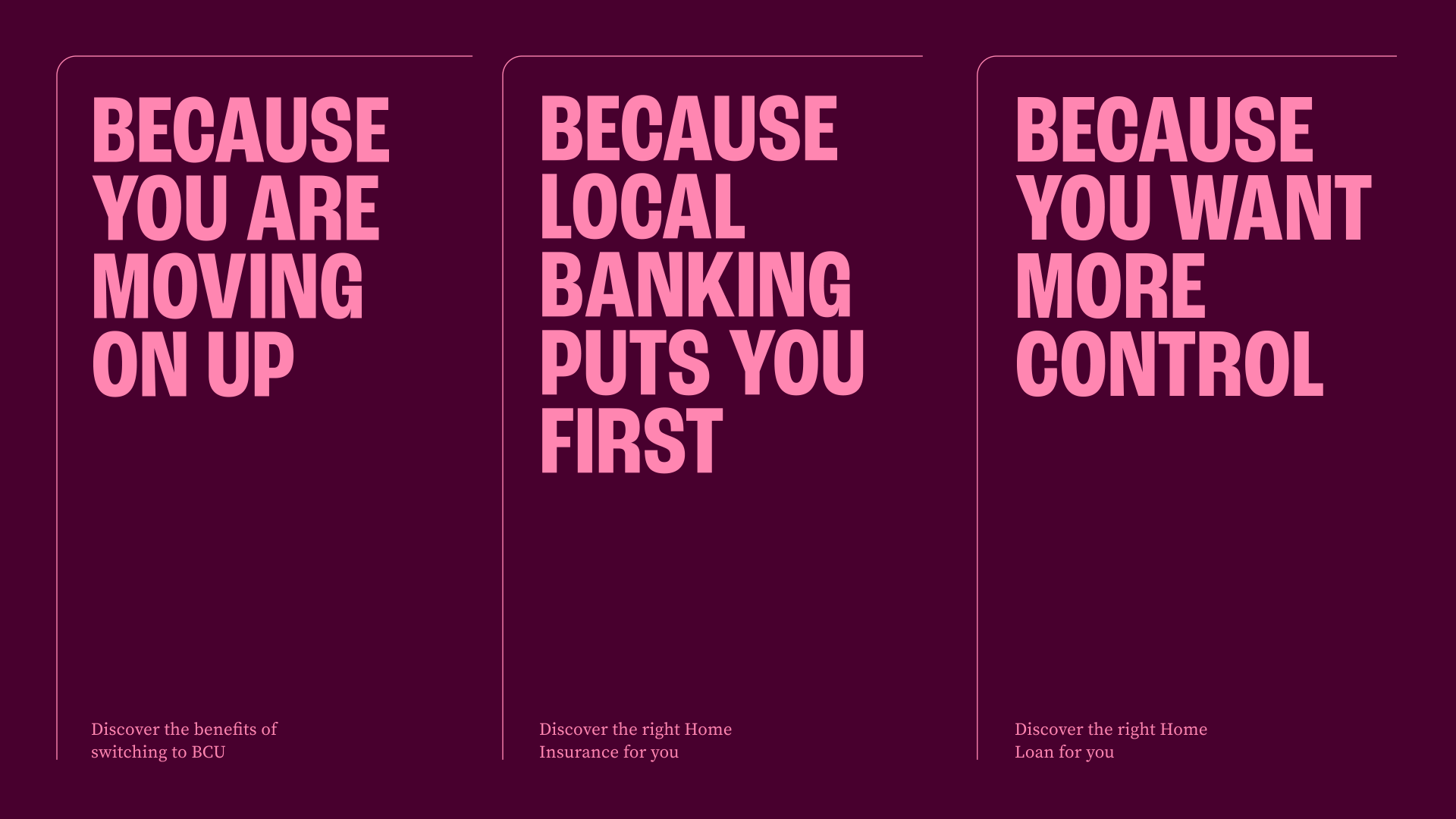
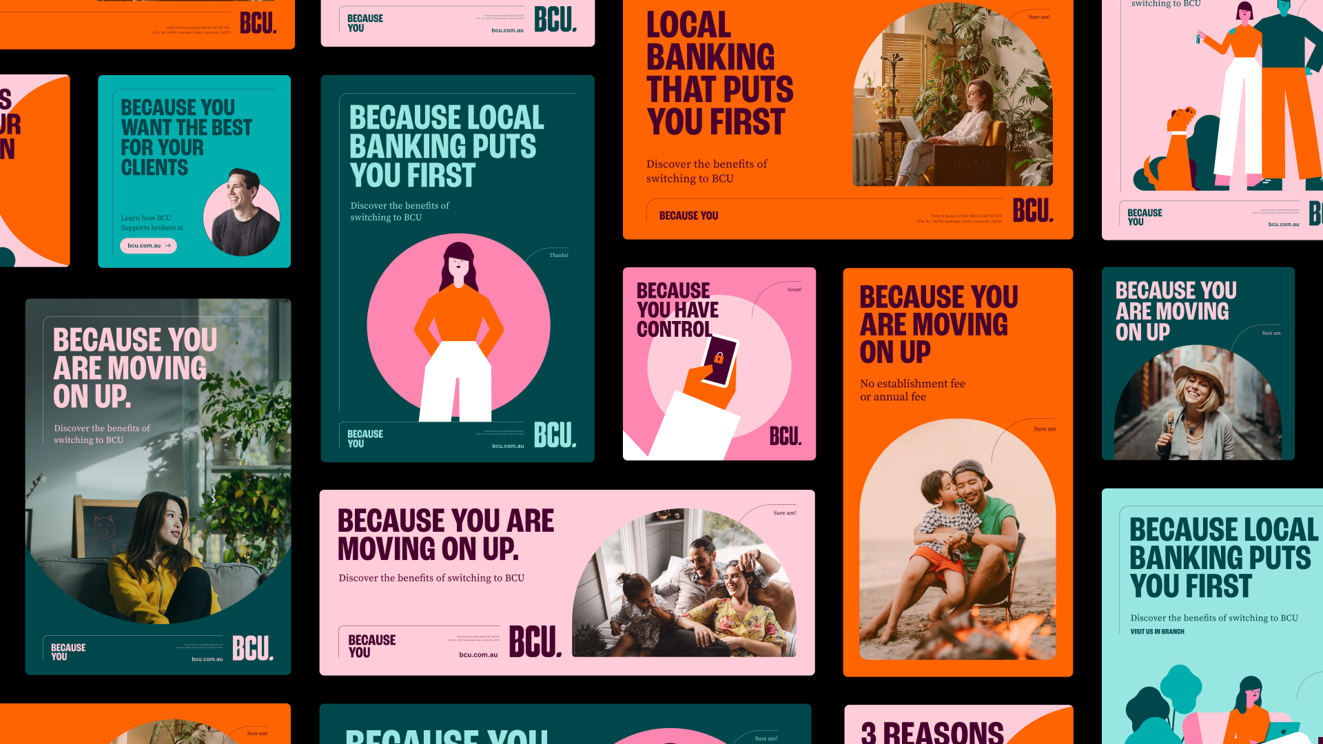
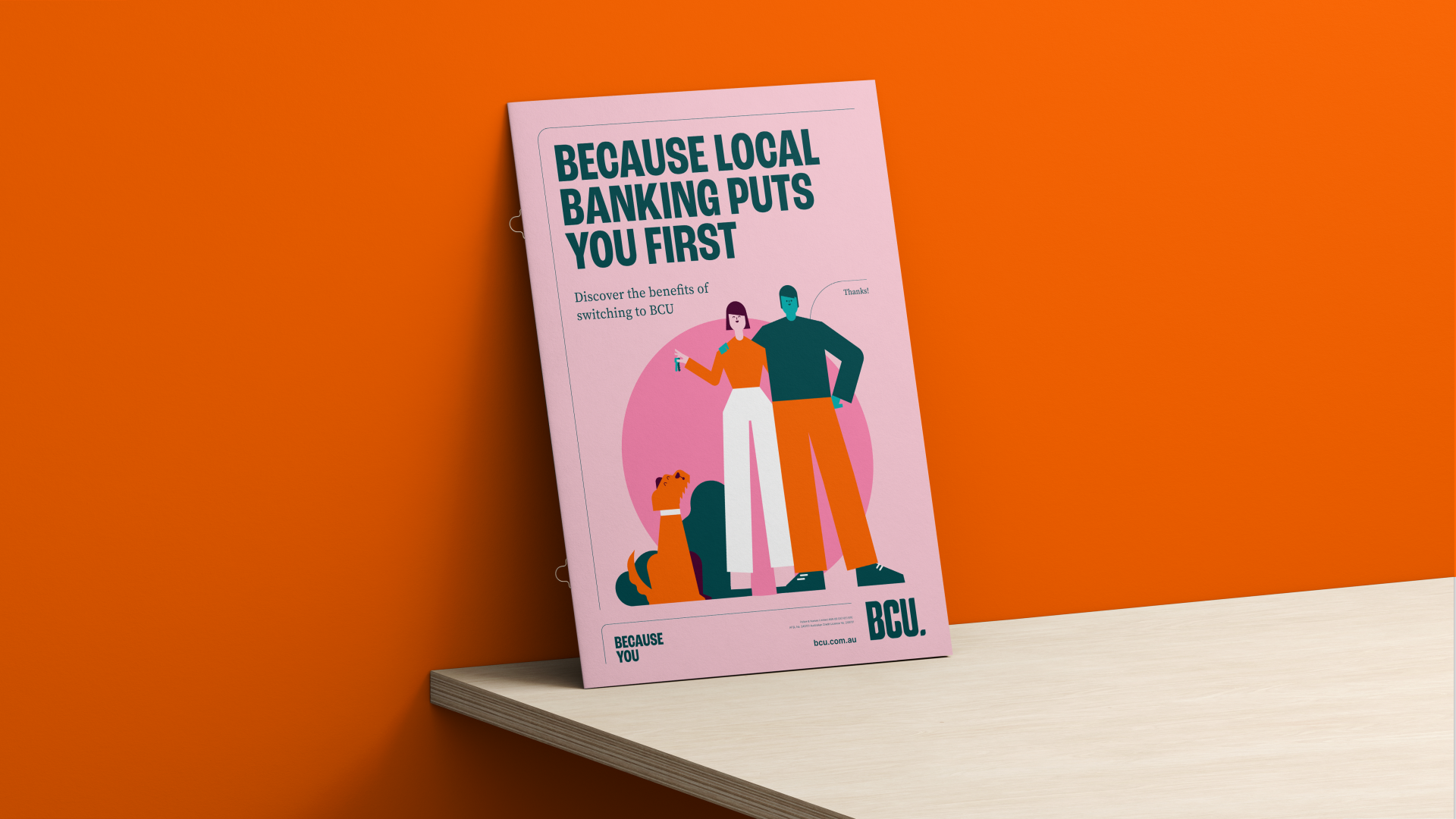
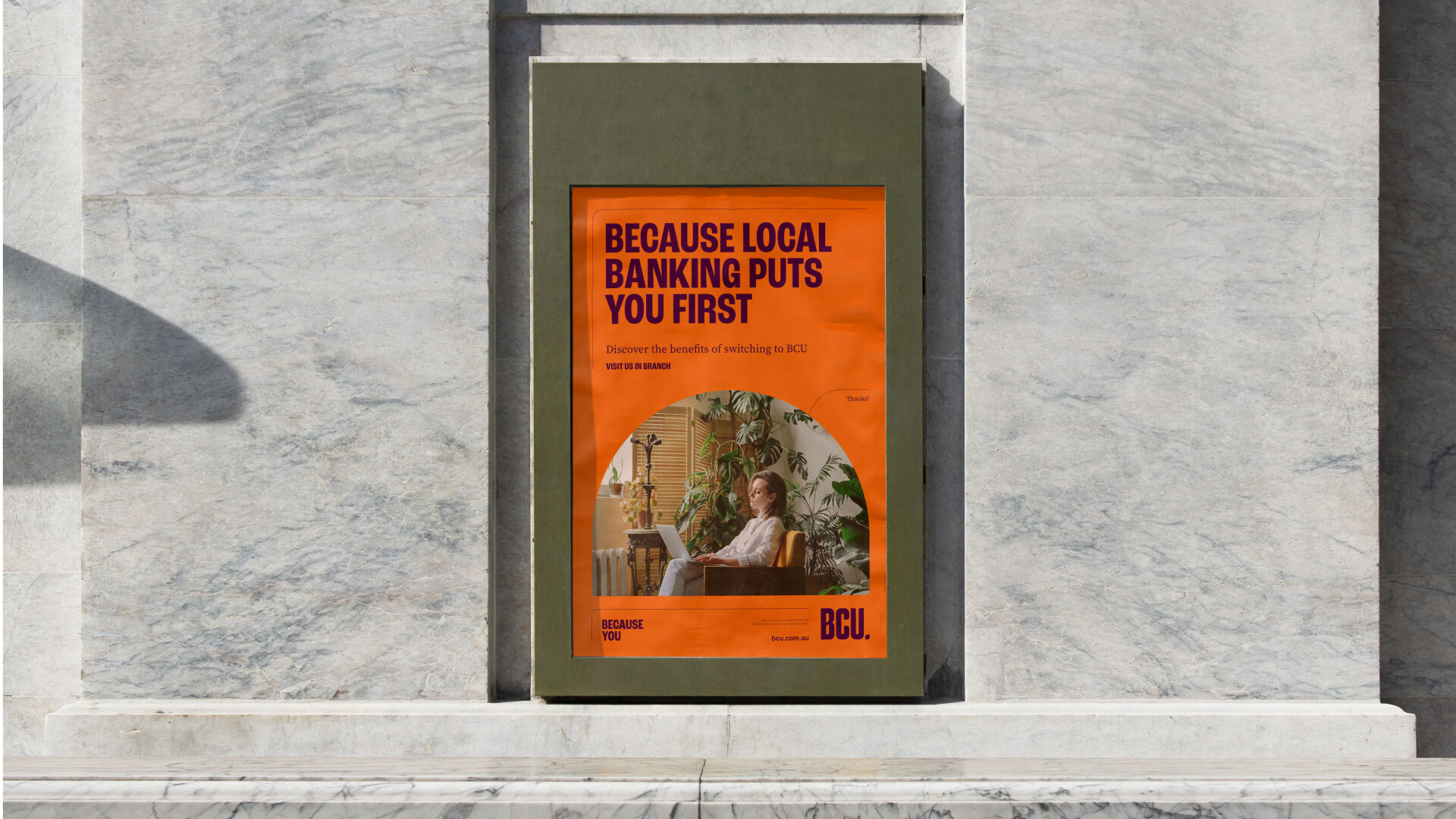
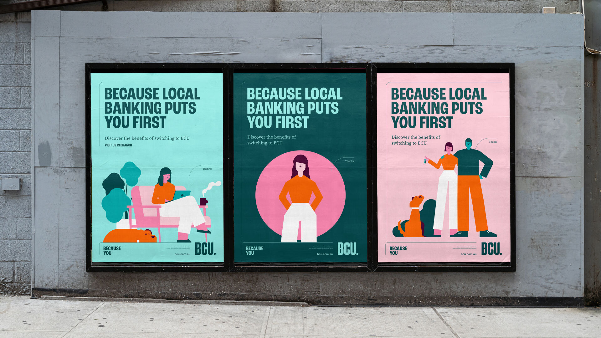
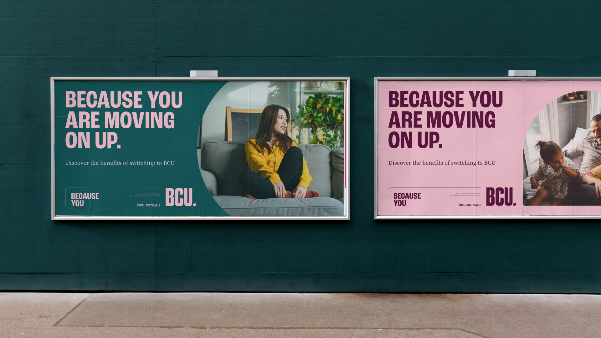
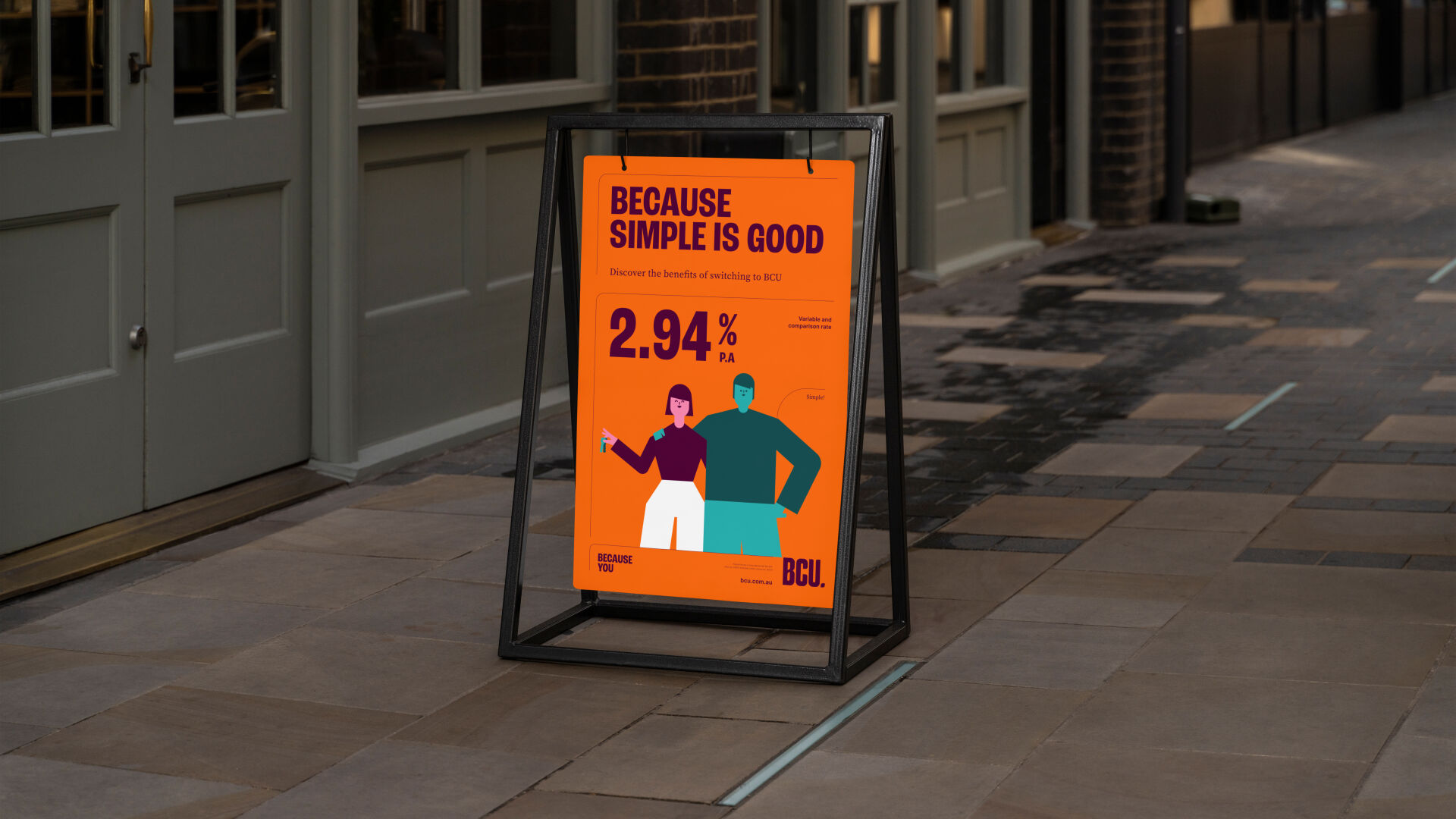
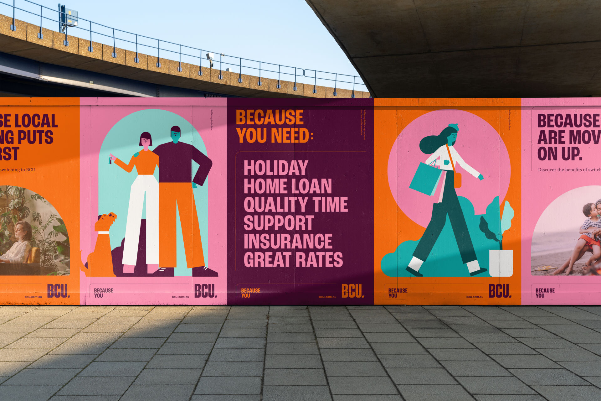
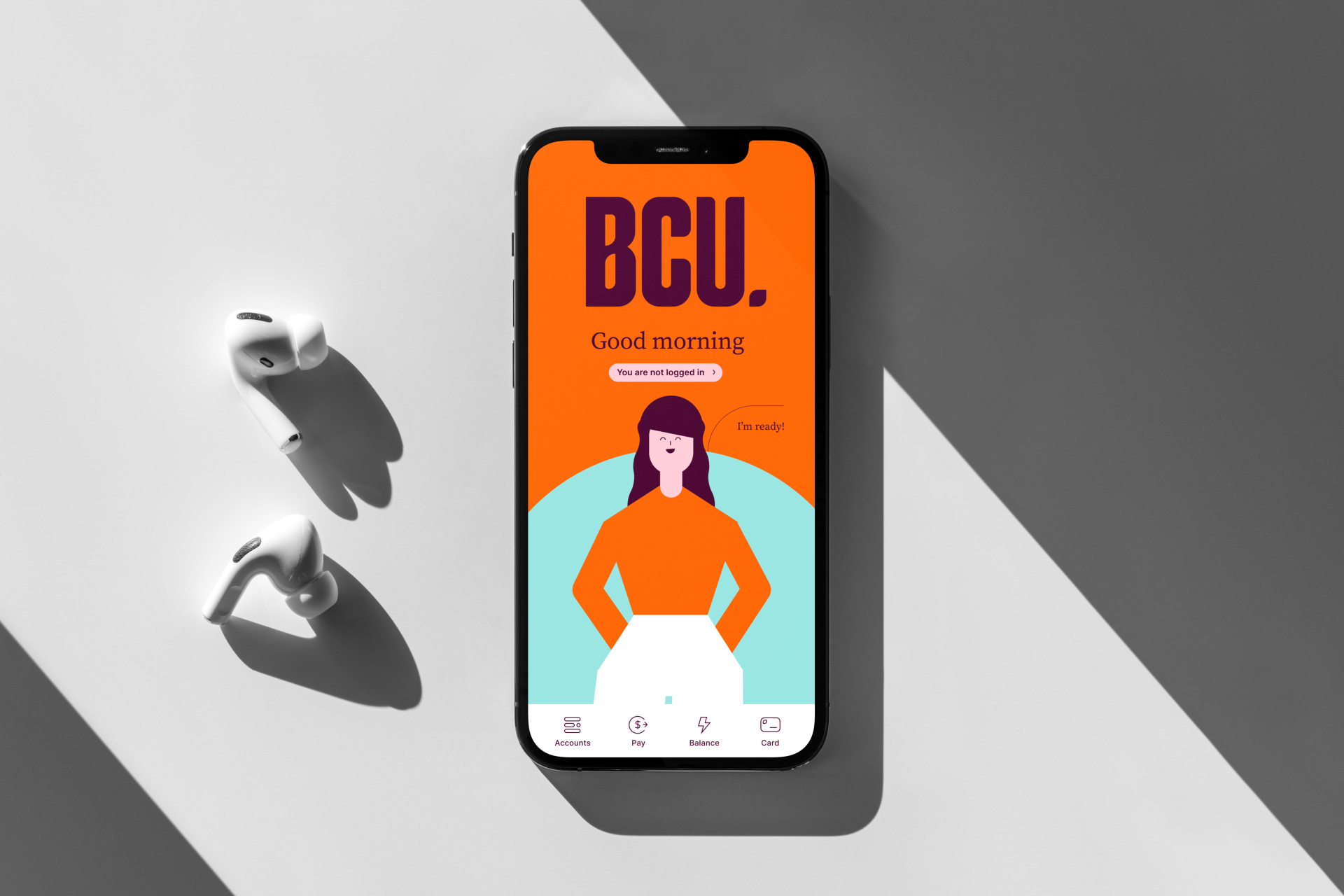
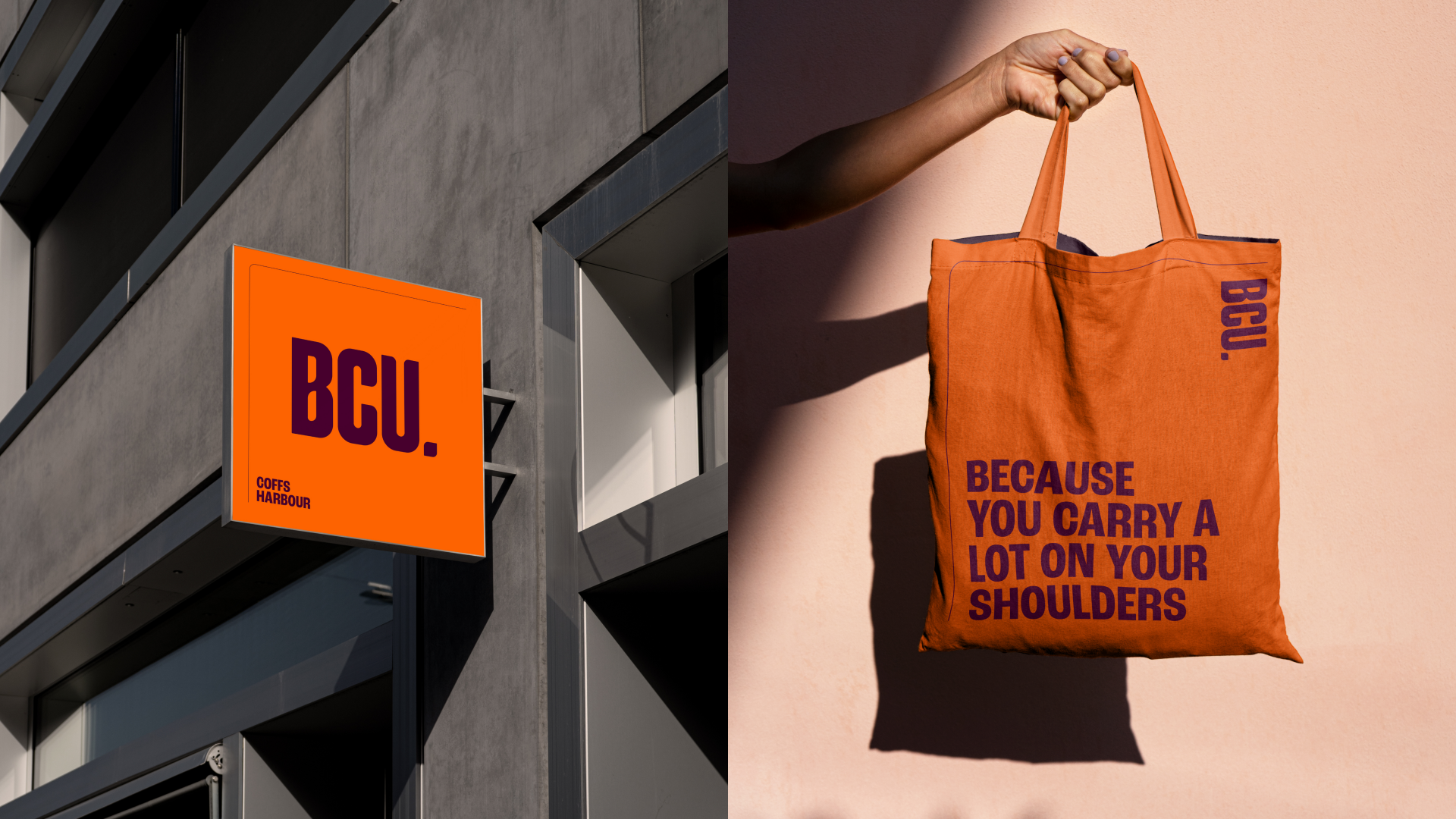
Developed with VMLY&R The BCU brand is anchored around the banana leaf. A square with two rounded and two sharp corners. This shape provided a frame for all content, from how the tagline is connected to the logo to how characters are given personality with speech callouts. The colour palette and typography equally reflected BCU's history with the orange and teal colours paying homage, and the pinks and purples providing a modern contrast and soft, personal tone. This tone was further emphasised with the characters developed by Bigfish to provide humor and lightheartedness to serious and life-changing moments, like buying a house. The characters were designed to be modular allowing BCU to create their own variations and poses.


Please note that all artwork shown is concept-only and the figures presented do not represent actual BCU products.